Building a Lovable HVAC Brand in a Market That Desperately Needs One
Case Study: Mom’s Heating & Cooling
If you’ve ever hired an HVAC company, you already know the vibe most brands give off: faceless trucks, generic “trusted service,” and pricing that feels like a mystery novel with missing chapters.
Mom’s Heating & Cooling needed the opposite.
They didn’t just need “better ads” or a nicer logo. They needed a brand that people could trust quickly, remember easily, and actually enjoy interacting with. In a category where most companies try to look “professional,” we built something more powerful: personal.
This is the case study of how we shaped Mom’s into a character-led home service brand, built around one simple promise:
Treat every home like it’s Mom’s.
The starting point: Good operator, crowded market, low differentiation
Venice Tabernero, the owner of Mom’s Heating & Cooling, is one of those rare leaders who is both technically serious and genuinely warm. He cares deeply about customers and takes pride in the work. The problem was that the market doesn’t automatically give you credit for that.
In the Lower Mainland, homeowners are flooded with HVAC choices. Most brands show up in the same way, and most customers make a decision with limited information, usually under some pressure (no heat, broken AC, confusing rebate decisions, rising utility costs).
So the question wasn’t “How do we stand out?” It was: “How do we become the safest decision?”
Our insight
Trust travels faster when it has a face.
Homeowners don’t trust logos. They trust people.
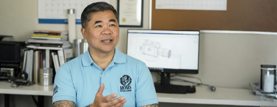
So instead of building Mom’s like a typical contractor brand, we built it like a modern consumer brand, with a recognizable lead character and a consistent worldview.
Venice became that character. Not in a fake, influencer way. In the “this person stands behind the work and you can feel it” way.
From there, we anchored everything around a narrative that makes sense instantly:
- Mom taught him how to work.
- Mom taught him how to treat people.
- So Mom’s Heating & Cooling treats your home the same way.
That story is the strategy.
The brand story we built: “We are Mom’s Boys.”
Mom’s isn’t a random business name. It’s a promise.
We developed a clear origin story that frames the company as values-first, customer-first, and proudly human. On the site, this shows up explicitly in the “We Are Mom’s Boys” message, where Venice shares how his mom shaped his work ethic, pride, and the way he treats people.
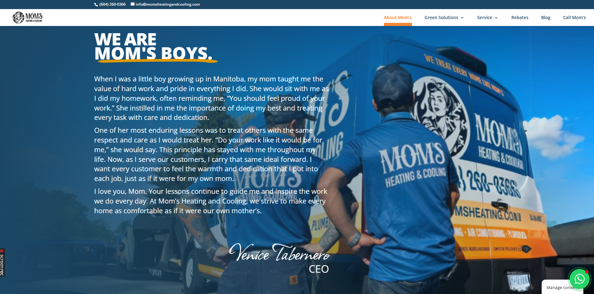
This matters because it gives homeowners something they almost never get from an HVAC company: context.
It answers the emotional question behind every purchase: “Who are these people, and can I trust them in my home?”
In a category filled with transactional messaging, this story creates a relationship.
Positioning: A caring, transparent home comfort team that makes complicated decisions feel simple
Once the story was clear, we shaped a positioning that could drive everything else:
1. Care, as Mom would expect
This became the brand’s emotional anchor. It shows up in language like “The Mom’s Test,” which turns a vague promise (“we care”) into a simple decision filter: we will only recommend what we would recommend to our own family.
2. Clarity, not confusion
HVAC pricing and rebates are where trust goes to die. So we leaned hard into transparency and simplification. “Mom’s Upfront Pricing” is positioned as a customer protection mechanism: no dispatch fees, no surprises, no games.
3. Smart help, not guesswork
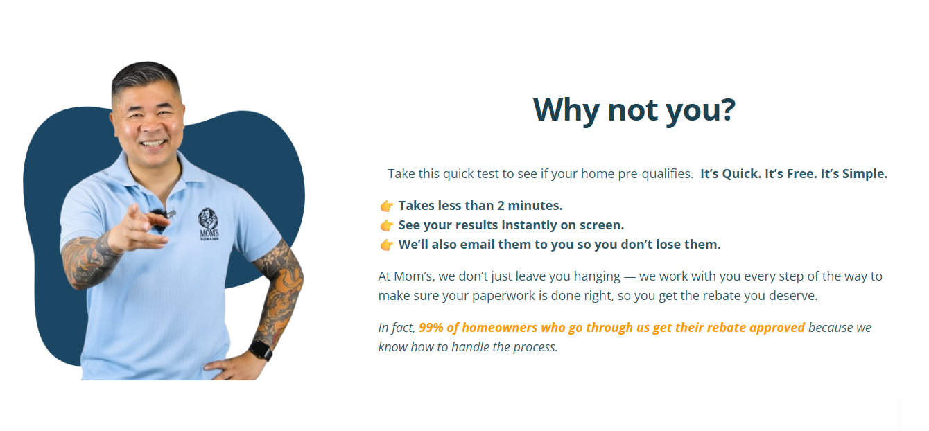
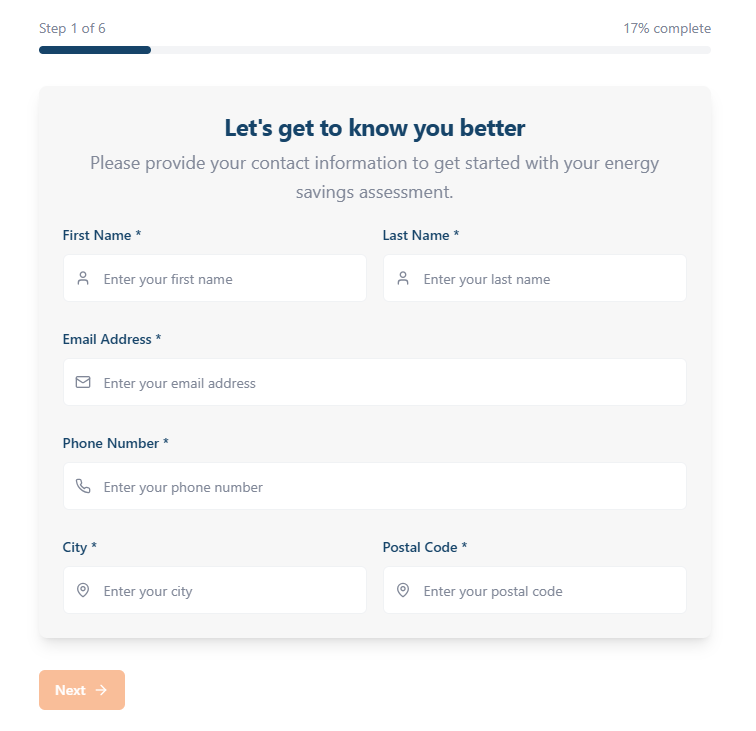
Government rebates can feel like a maze. So we use an AI-powered pre-qualifier that helps homeowners quickly understand if they may qualify, without reading a stack of program rules. It is fast, clear, and gives instant guidance, then we back it up with a real human who double-checks everything and helps with the paperwork.
4. Friendly confidence, not stiff professionalism
Instead of trying to look like a corporate utility provider, the brand shows up like the reliable, funny, capable people you’d actually want to deal with when your system breaks.
That combination is rare, and it’s why the brand feels different immediately.
Tone and voice: Warm, direct, and funny in a way that builds trust
A lot of brands try to use humour and end up sounding like a desperate uncle on Facebook Marketplace.
We avoided that by using humour strategically, with clear rules:
1. Humour is allowed when it helps the customer feel safe, informed, and less stressed.
2. Humour is not allowed when it creates confusion, looks unprofessional, or distracts from the decision.
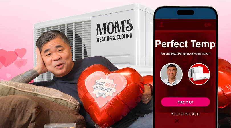
The result is a tone that feels human and memorable without losing credibility. You see it in playful visuals and unexpected creative concepts, but the underlying message stays consistent: Mom’s is competent, caring, and straight with people.
In practice, this kind of humour creates something powerful: it makes customers pay attention long enough to trust you.
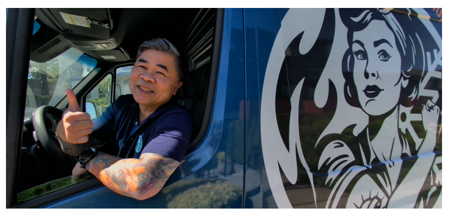
Visual identity and brand assets: Consistent “Mom’s world,” not random marketing
We built a recognizable visual system across the web and ads that feels like the same brand every time:
- Blue as the trust colour (calm, dependable, clean)
- Orange accents for warmth and action
- High-contrast, easy-to-scan headlines
- Real people, real homes, real scenarios
- Venice is the recurring “anchor” so the brand is instantly identifiable
Even when we used more playful, creative (illustrations, unexpected scenes, bold concepts), the typography, colour logic, and structure stayed consistent. That consistency is what makes a brand feel “big,” even when the company is still growing.
Execution: How the brand shows up across real customer touchpoints
1. Website messaging that acts like a sales rep
The homepage and key landing pages do three jobs quickly:
Explain the offer simply (rebates, service, installs)
Reduce anxiety (upfront pricing, no surprises, guidance)
Create belief (clear values, clear story, recognizable leadership)
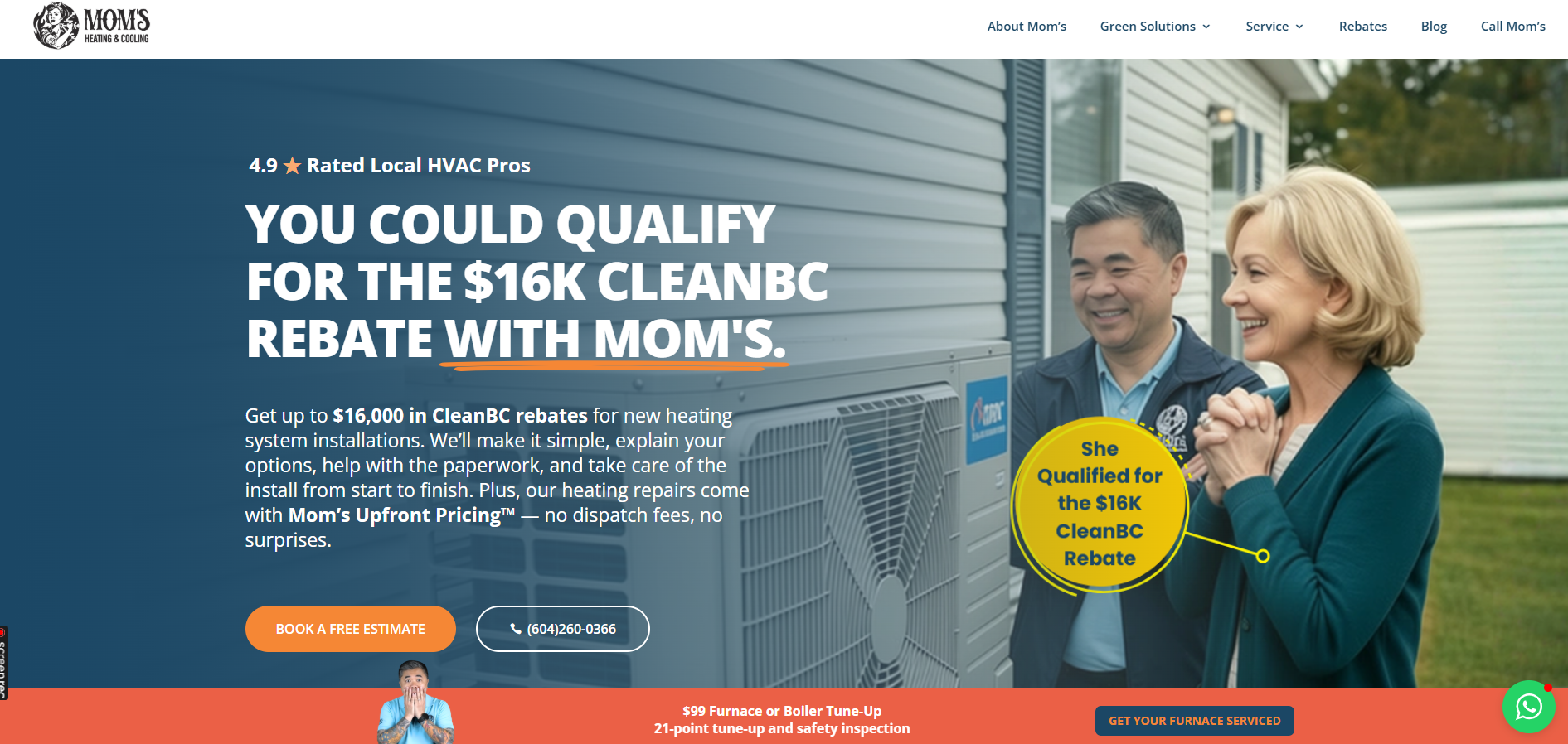
For example, the CleanBC rebate messaging is framed in a way that feels helpful instead of salesy: you could qualify, we’ll explain your options, we’ll help with paperwork, we’ll take care of the install, start to finish.
That’s not a feature list. That’s reassurance.
2. Venice is the brand’s “trust shortcut.”
In most HVAC ads, you see stock families, generic technicians, and nothing that feels grounded.
With Mom’s, Venice appears consistently. Customers see the same face in ads, on the site, and in brand communication. That repetition creates familiarity, and familiarity lowers perceived risk.
It also signals accountability. When the owner is visible, it feels like someone is actually standing behind the promise.
3. Values turned into usable customer language
We translated internal values into customer-facing meaning.
Instead of “integrity” and “excellence” floating around like corporate wallpaper, the values show up as clear, memorable standards, like:
- Positive Mental Attitude
- Work Shockingly Hard
- Be World Class
- Earn Trust
- Give More Than Expected
This gives customers a simple mental model: “These people have a code.”
4. Brand personality integrated into conversion assets
Even in direct-response moments, we kept the brand voice intact.
Calls-to-action feel warm and confident. Support feels approachable. The brand doesn’t switch personalities depending on the channel. That consistency is what makes customers feel like they’re dealing with a real team, not a marketing funnel.
Why this worked
We didn’t “market” an HVAC company; we built a relationship brand.
Most HVAC marketing tries to win on urgency and discounts. That’s a race to the bottom.
Mom’s wins by being the most emotionally safe decision in the category:
- A clear story people remember
- A visible owner that people recognize
- A tone that feels human
- A promise that feels protective
- A customer experience that feels straightforward
In other words, a brand strategy that performs.
How we measure success: What we track for brand-led growth
Because this case study focuses on brand, the metrics that matter aren’t only last-click conversions. We track indicators of “trust velocity,” like:
- Higher conversion rates on estimate booking pages over time
- Lower cost per lead as creative familiarity increases
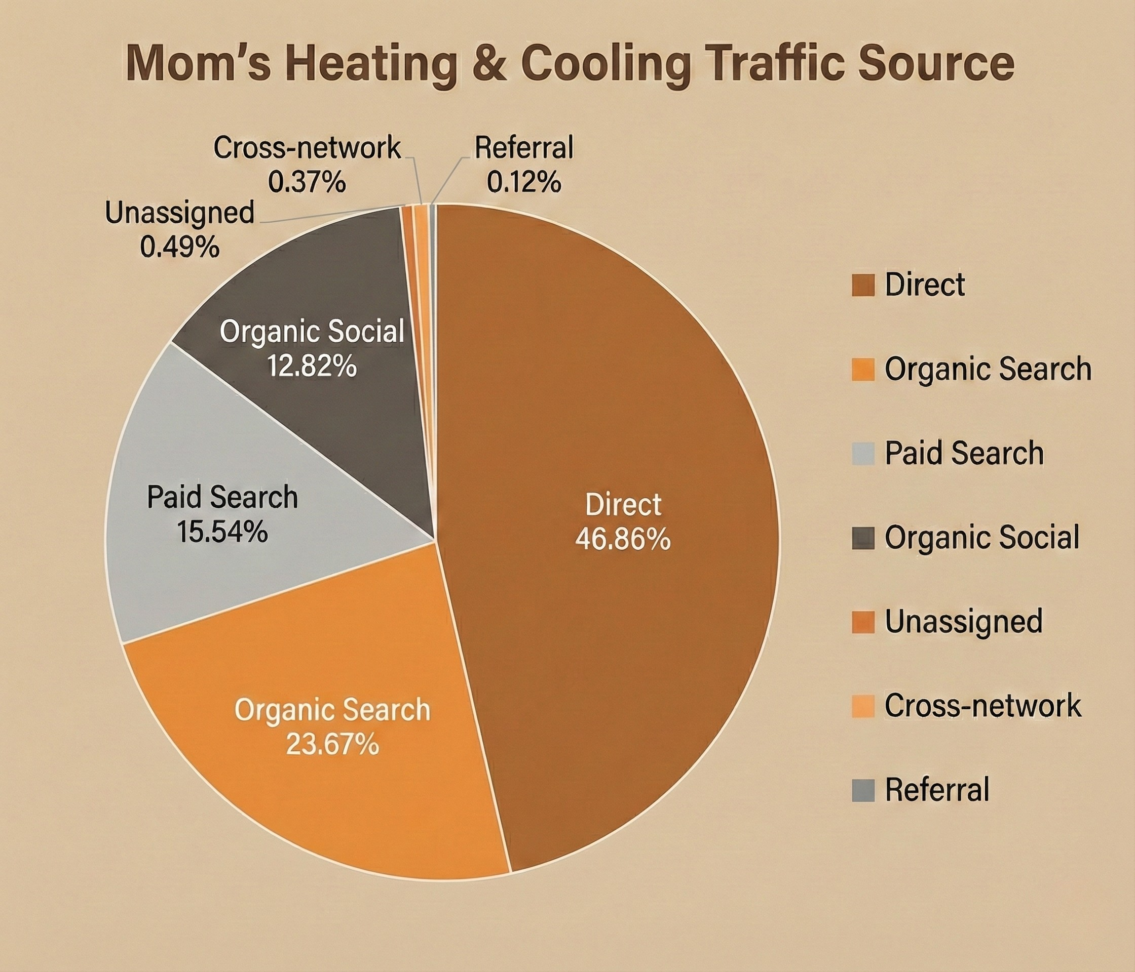
- More branded search and direct traffic (people looking specifically for “Mom’s”)
- Higher close rates from leads who “already feel like they know you.”
- More reviews that mention Venice, transparency, and feeling taken care of
The takeaway for other service businesses: If you want premium results, stop hiding behind your logo
Mom’s Heating & Cooling is proof that local service brands can feel iconic, not generic.
You don’t need to act like a massive corporation to win. You need to be consistently recognizable, emotionally safe, and strategically human.
And if you have a founder who genuinely cares, as Venice does, that’s not just a nice detail.
That’s the brand.